I’ve done CRO for eleven years. I’ve run tests that raised conversion rates for childcare, trucking, and salon brands, and I set up the GA4 and GTM tracking so the numbers can be trusted.
Let’s talk split-testingConvert.com interviewed me about how I prioritize experiments, write hypotheses, and avoid the mistakes that sink most CRO programs.
Read the article →Selected experiments · client names withheld
One more A/B test, three smaller wins, and three results measured without a split test.
When I couldn’t run a controlled test, I still measure the change with year-over-year and before/after comparisons, and I treat those results as directional.
Four unsolicited mobile redesigns of public pages: two product pages, one paid landing page, one homepage hero. These are my own concepts. None has been tested and I claim no results. Each one shows what I measured on the live page, the hypothesis, what changed and how I would test it.


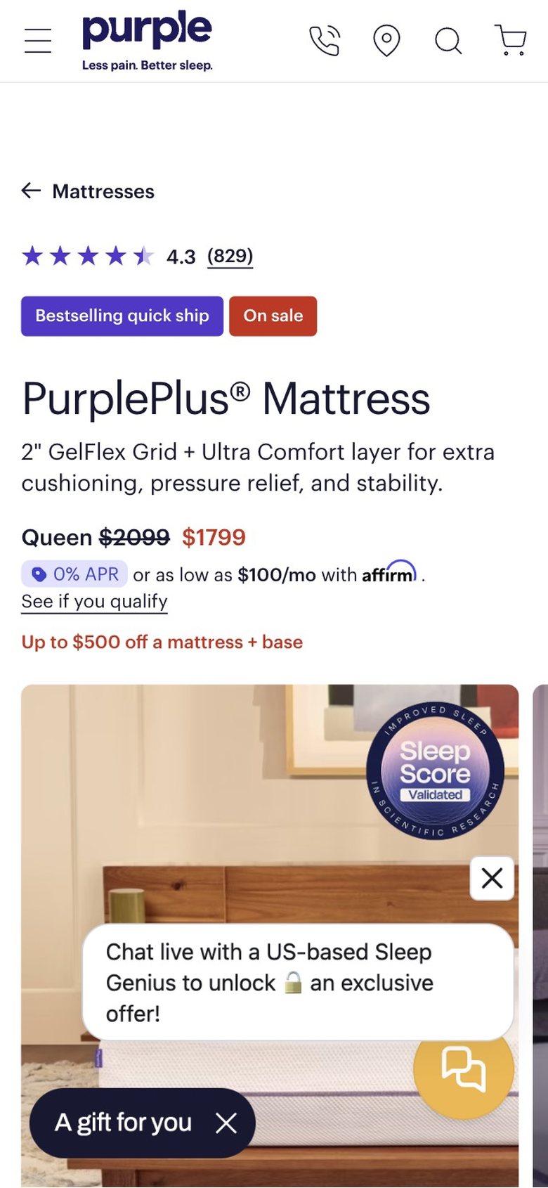
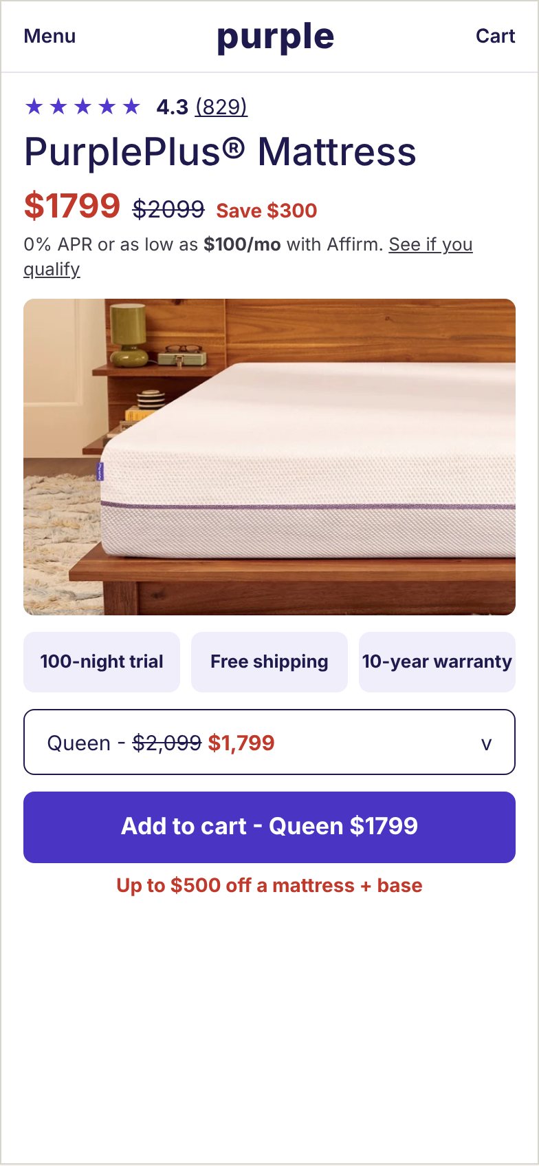
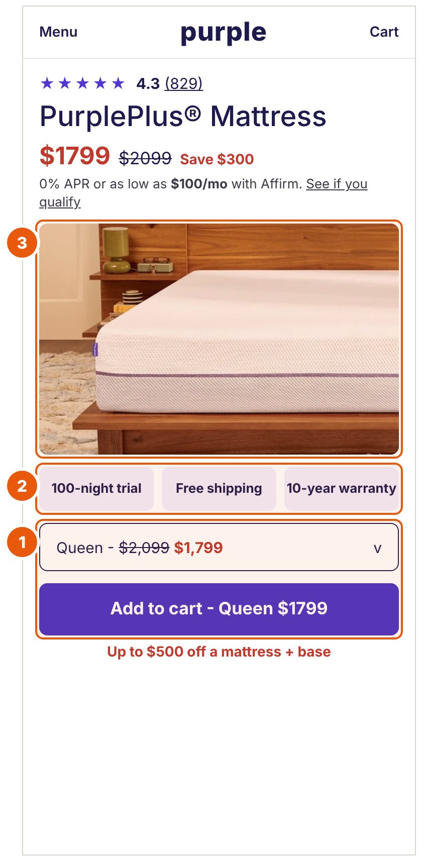
No add-to-cart or size selector in the first 844px. Rating sits at y182, price at y381, and the gallery starts at y487. A chat bubble (y657-739) and a "gift" pill (y773-824) cover the lower third of the first image. The next screen down holds feature lines, a size dropdown, frame guidance and a base add-on card.
If the price, trial terms and add-to-cart button share the first screen, and the pop-ups wait until after the first scroll, then more mobile visitors will add to cart, because the current page asks them to scroll past a full-width gallery and two overlays before they find a way to buy.
Primary metric - add-to-cart rate on mobile product page sessions.
Guardrails - revenue per visitor, Affirm prequalify starts, and chat-assisted orders, since the chat prompt now appears later.
Unsolicited concept. Not affiliated with or endorsed by Purple. Based on the public mobile site as of Oct 12, 2026. Before and after image


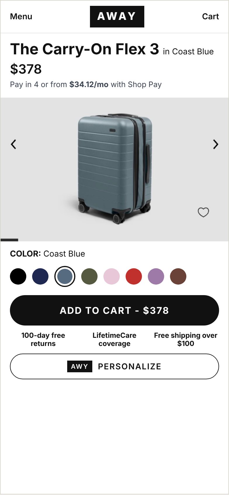
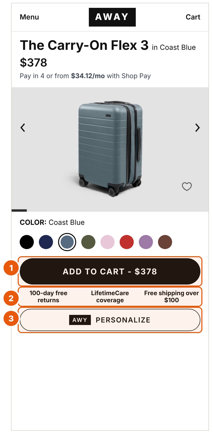
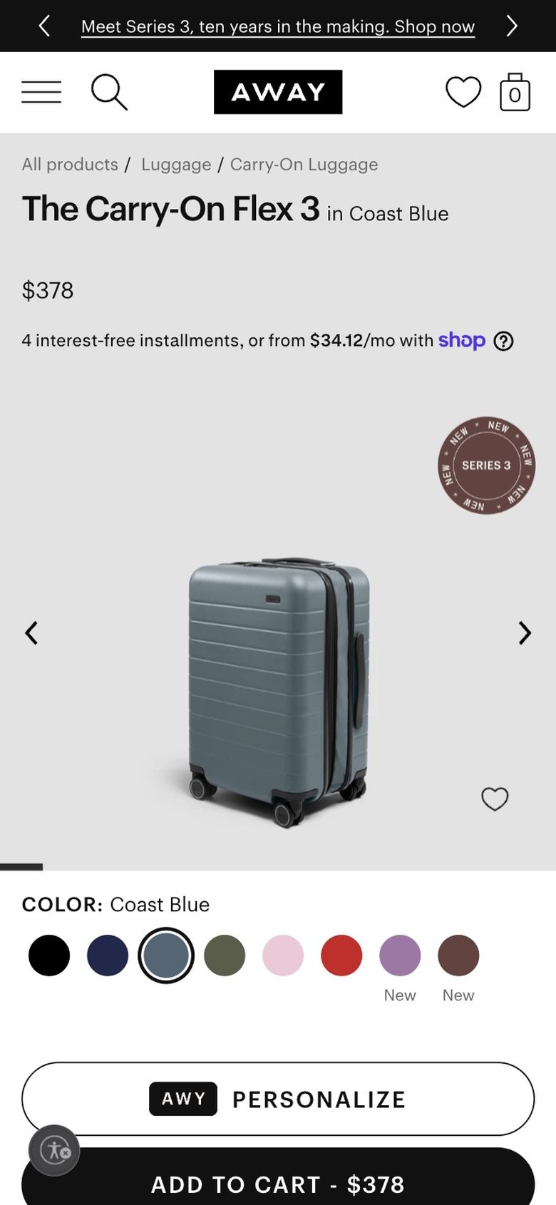
The outline PERSONALIZE button (y745-796) sits above Add to Cart (y804), which the bottom edge cuts off at 844. An accessibility button overlaps its left corner. A sticky Add to Cart bar appears only after scrolling. No return, shipping or review text appears in the first screen.
If Add to Cart sits above PERSONALIZE inside the first screen, with the 100-day return and lifetime coverage terms beside it, then more mobile visitors will add to cart, because the primary button now sits on the screen edge under a competing button and has no reassurance near the decision.
Design decision - the live page shows 5.0 stars from only 5 reviews. That is too thin to use as proof, so the concept leaves it out.
Primary metric - add-to-cart rate on mobile product page sessions.
Guardrails - PERSONALIZE usage, revenue per visitor and return rate.
Unsolicited concept. Not affiliated with or endorsed by Away. Based on the public mobile site as of Oct 12, 2026. Before and after image


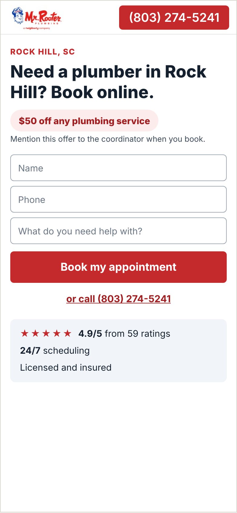
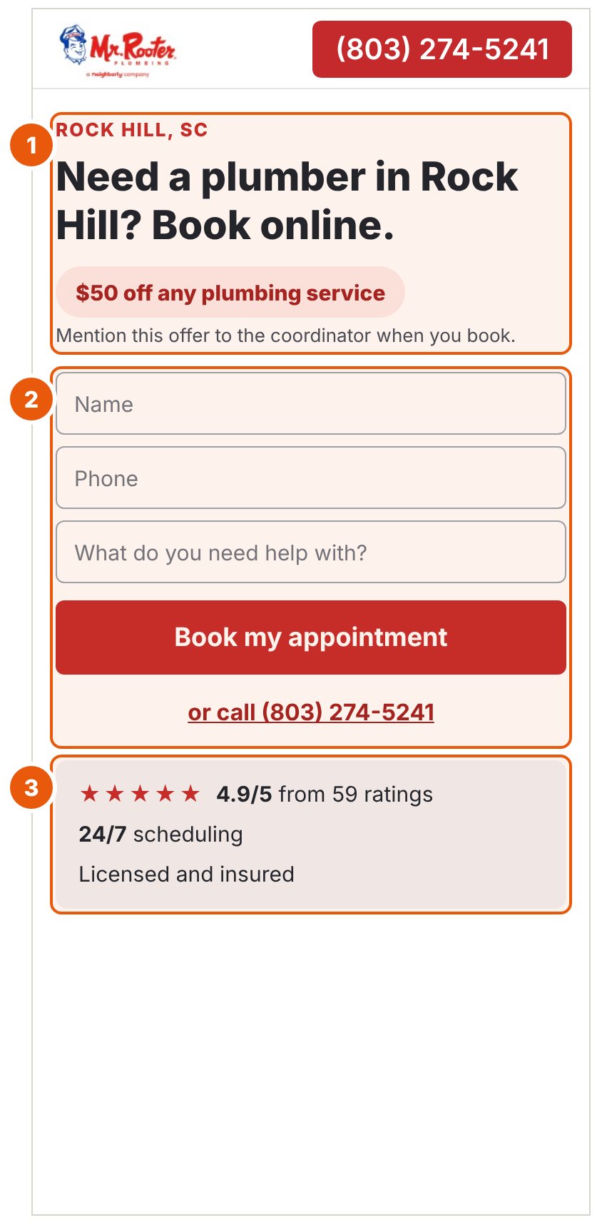
Nine lines of white text stack four messages (service area, brand promise, $50 offer, "Schedule appointment") between y150 and y640. No form field is visible in the first 844px, even though the copy says "Submit form to schedule". Nothing on the page explains or backs the $50 offer.
If the page opens with one headline, the offer and a visible form, with local proof beneath the button, then more paid mobile visitors will submit the form or call, because they now read four messages and scroll past the fold before they can act on the one the page asks for.
Example copy - the live page gives no offer terms and the capture shows no form, so the three fields and the line "Mention this offer to the coordinator when you book" are invented for the concept.
Primary metric - leads per paid mobile session (form submits plus click-to-call).
Guardrails - booked-job rate and lead quality, so low-intent leads do not read as a win.
Unsolicited concept. Not affiliated with or endorsed by Mr. Rooter Plumbing. Based on the public mobile site as of Oct 12, 2026. Before and after image

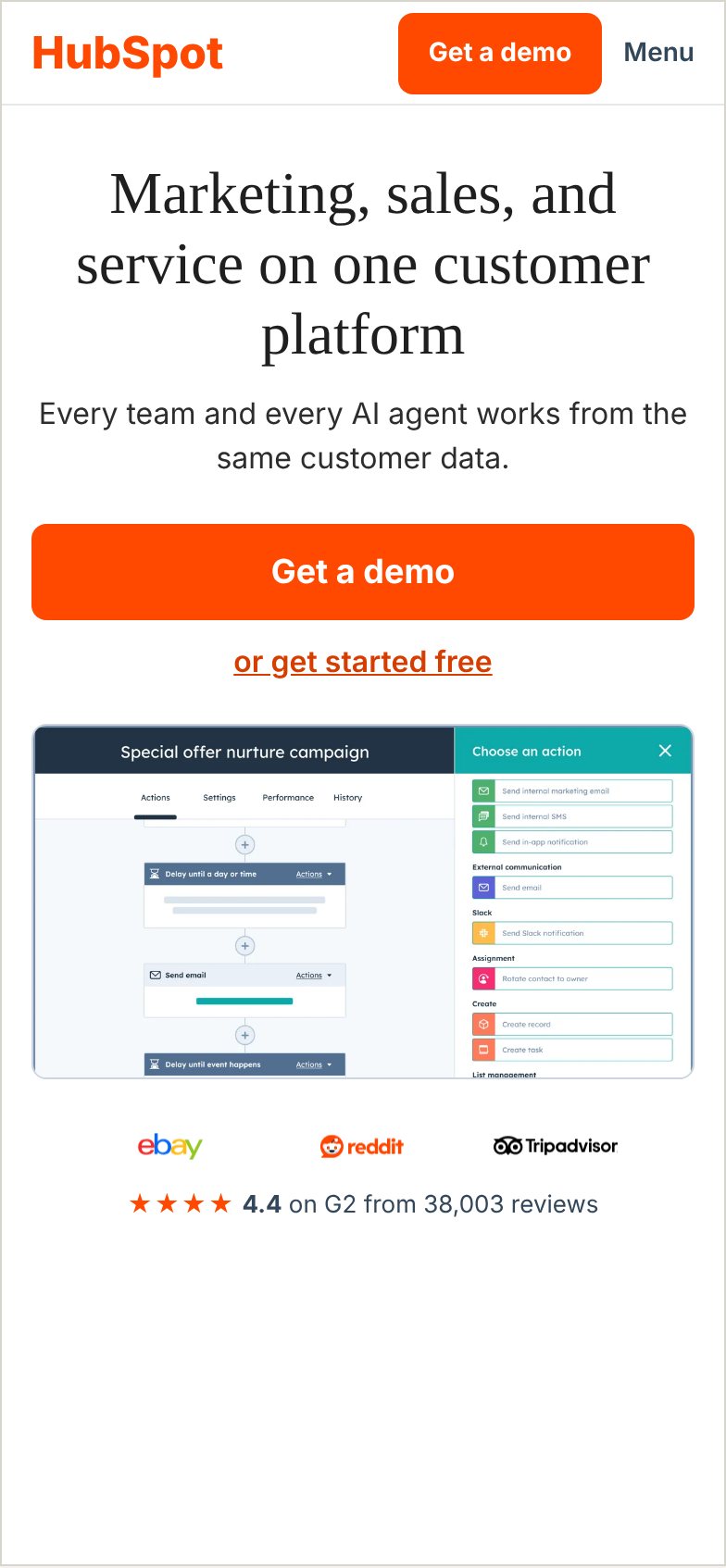
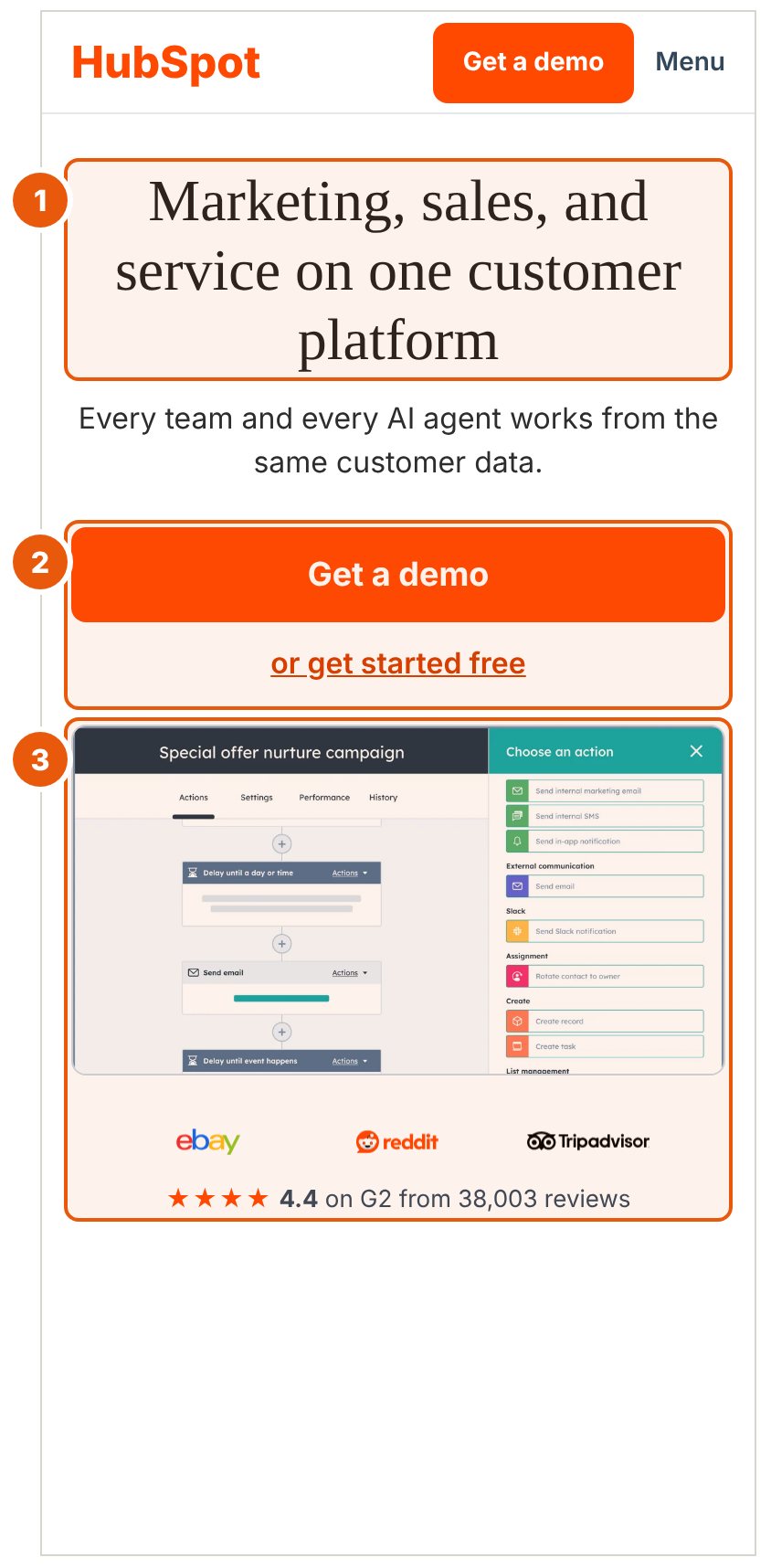
6-line, 251px headline pushes the "Get a demo" CTA to y601, cut off at a 664px fold. A second near-equal CTA sits below it. No customer proof or product visual in the first 800px.
If the headline is cut to 3 lines, the product and customer proof appear in the first screen, and the two CTAs are separated by intent (demo as primary, free start as a text link), then more mobile visitors will start the demo form, because the current layout pushes the primary CTA to the fold edge and presents two near-equal choices with nothing to justify either.
Primary metric - demo CTA click-through and demo form start rate.
Guardrails - free signup volume and qualified pipeline per visit.
Unsolicited concept. Not affiliated with or endorsed by HubSpot. Based on the public mobile site as of Oct 12, 2026. Before and after image
Want this kind of teardown on your own pages?
Let’s talk split-testingMost CROs hand analytics off to a developer. I do it myself: GTM containers, GA4 setup, custom events, Looker Studio dashboards. I build and maintain the tracking that makes testing possible.
Sole analytics/tracking engineer for 10 active client accounts at Johnson Group. Set up GA4 properties, custom events, and conversion tracking from scratch.
Owned all GTM containers for 70+ clients at Epic Notion. Custom dimensions, CRM integrations through Webhooks and Zapier, and 40+ written SOPs for tagging.